Drivers need to pay hundreds of dollars for fuel as an on trip expense before they get paid at the end of the job. Many drivers do not have the cash to pay for fuel expenses to start the trip.
CloudTrucks offer Pickup Pay and CT Credit to solve this problem but these two offerings are suboptimal for several reasons:
CT Credit is undermined by low maximum limits and high risk, making it ineffective as a substitute.
Pickup Pay is constrained by restrictive usage, additional fees ,inefficient manual processes.
Additional challenges include the absence of a dedicated fuel card perk and cumbersome, partner-specific discount integrations that hinder optimal fuel transaction tracking.
Fuel card provides more flexibility for drivers to get pre-trip funds to help them get on the road.
Fuel card is a industry standard that can help drivers save on other cash advance fees.
Fuel card can improve the utilization of CT discounts and provide a healthier cash flow for both CT and drivers.
After we made the decision to build CT Fuel card, I worked with the pm and engineer to finalize the goal for this project.
Design goal
Build the fundamental features for CT Fuel card, including Fuel card sign up, pay card, view card balance and credit, view transaction history and statement, manage card and cardholder.
Business goal
Increase fleet fuel spend on CT-issued cards from 57% to 80%
Increase auto-generated fuel receipts on CT-card transactions from 9% to 70%
Increase utilization of CT Fuel network
A
During the ideation, we identified a few key challenges where design could potentially have great impacts.
How might we balance between risks and UX in payment collections?
Collecting payments for the Fuel Card balance is challenging given users’ unique spending patterns and the typical financial constraints of truck drivers. In addition to mitigating risk, we must prioritize a smooth payment experience.
How might we provides a more holistic view of users’ finances?
With the launch of the Fuel Card, we need to update the existing CloudTrucks Cash page's information architecture to accommodate new use cases and clearly convey users’ finance.
How might we streamline the sign-up flow to reduce potential frictions?
We are partnering with Stripe and Cross River Bank to launch Fuel Card, and we need to streamline the sign-up flow to reduce any frictions caused by integration of Stripe KYC flow and bank compliance.
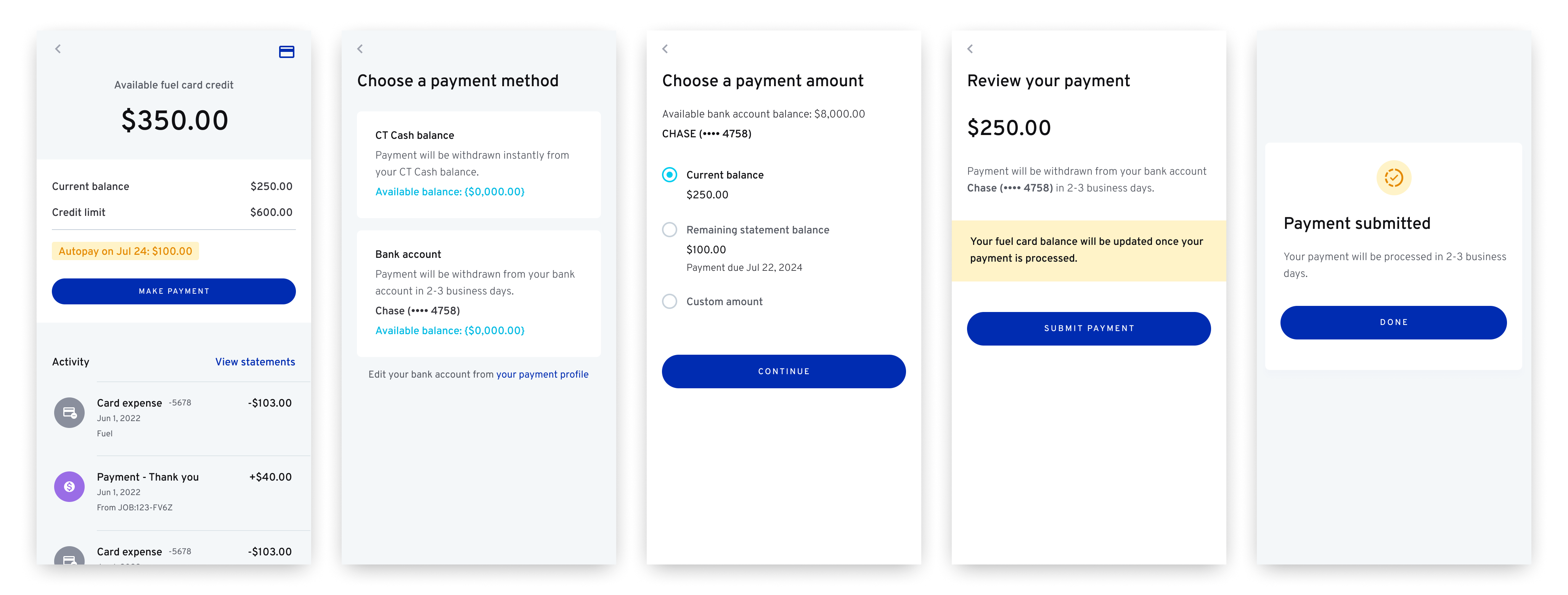
I led a discuss session between Design, PM, Engineering and Risk, and I used design to facilitate the team to figure out a plan where we can minimize the risk of not getting money back without sacrificing too much on user experience. And we ended up choosing waterfall payment collection because minimizing risk is our first priority. This is the lesson we learned from the previous failed credit product that we launched.

Simulate payment scenarios to help the team make a decision
However with waterfall payment collection, it could be unpleasantly surprising for users when the payment happens. So the design should clearly communicate when and how payments are collected.
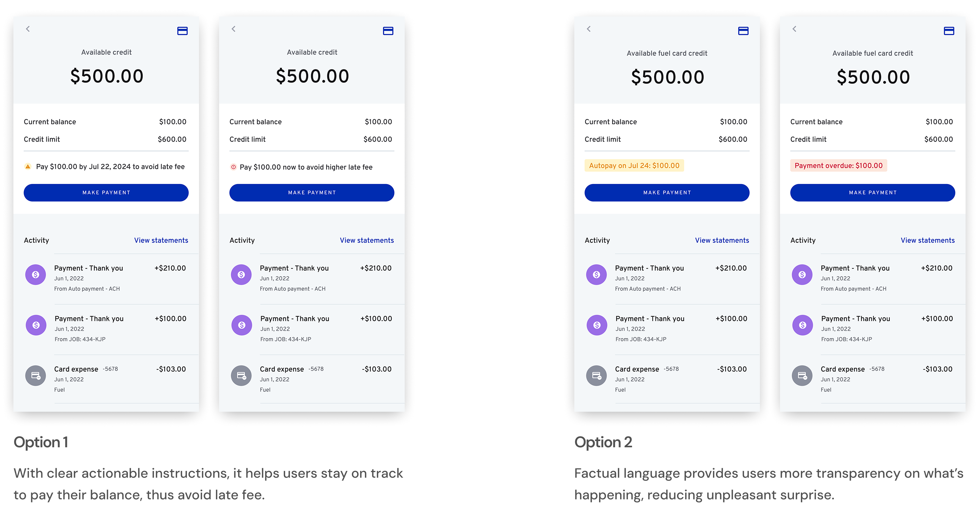
After sketching out different payment scenarios, we decided to go with option 2. Because with waterfall payment, 95% of the payment collections will happen automatically every week. So keeping users informed of everything that's happening to their accounts becomes more important than nudging users to make a payment.
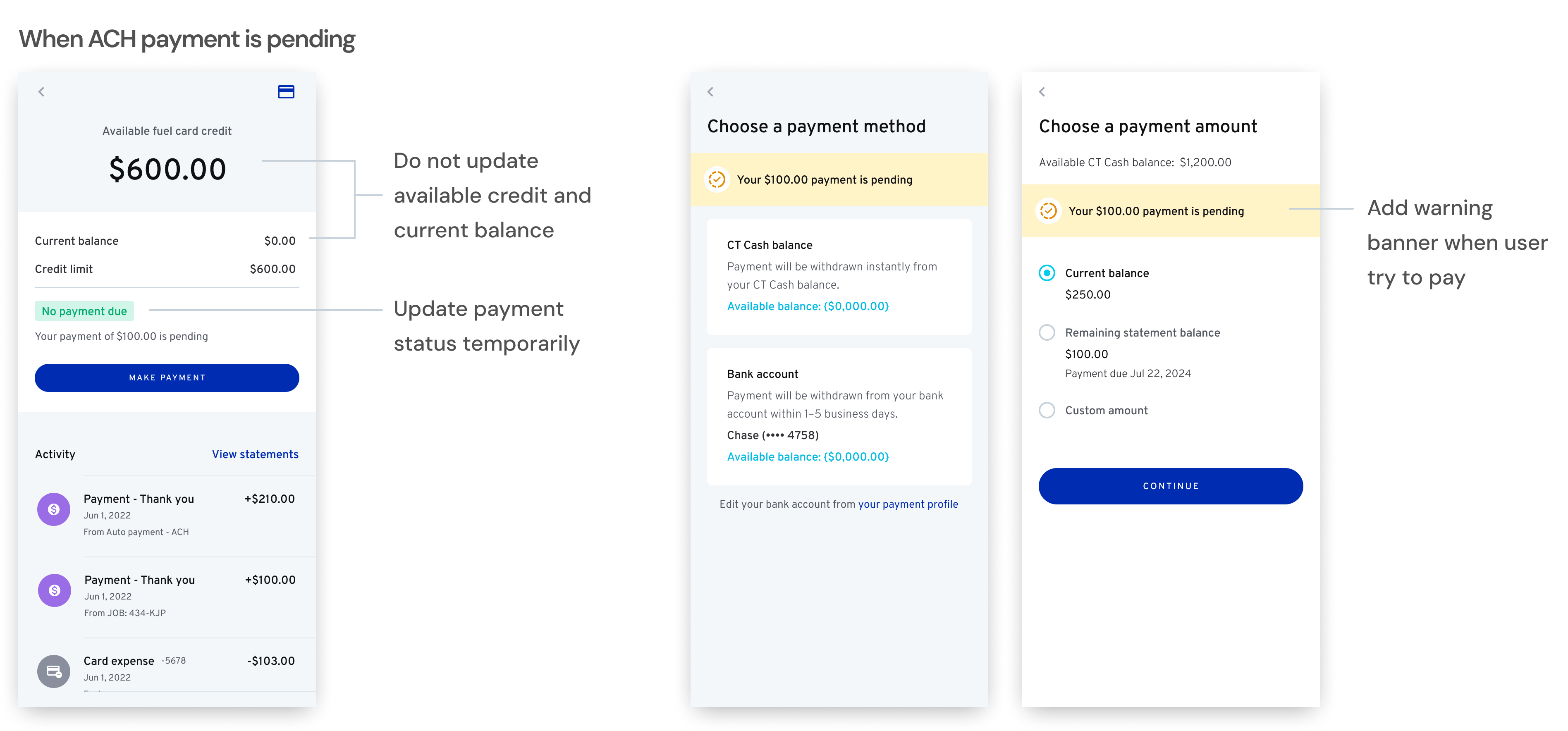
We also ensured the transparency by labeling out pending payments, to help users avoid making repetitive payments.
Using factual language in card payment does not mean that we don't give users actionable instructions when necessary.
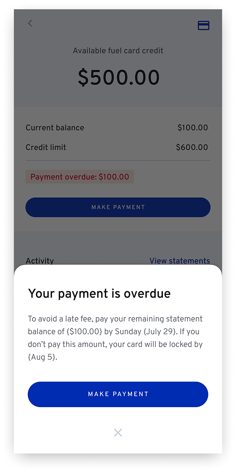
When the payment is overdue it requires users immediate action, we use a bottom sheet to reinforce user's payment status and potential consequence. As a result, the experience help users make payments on time and avoid a late fee or card being locked.
Designing for Fuel Card also opened an opportunity for us to redesign the Cash page that was not working well to accommodate changes with new features coming in. Through an UX audit and feedback from customer service team, we identified a few key issues with existing design.
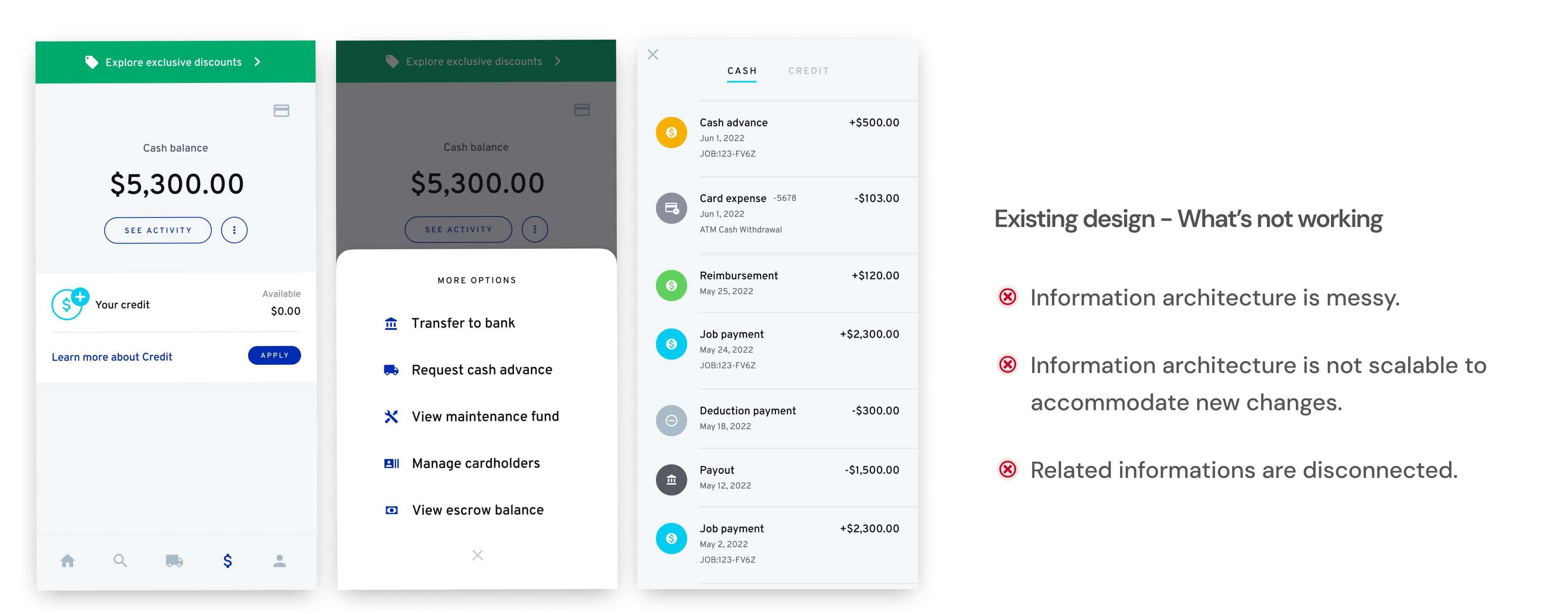
Existing Cash page
Then we cleaned up the information architecture, making it easier to navigate through different accounts and increasing scalability.

Based on the new information architecture, we went through many UI explorations for CT Cash page. And after rounds of design critique, we had a winner for it has a more clear visual hierarchy and more consistent design pattern which help reduce distractions.
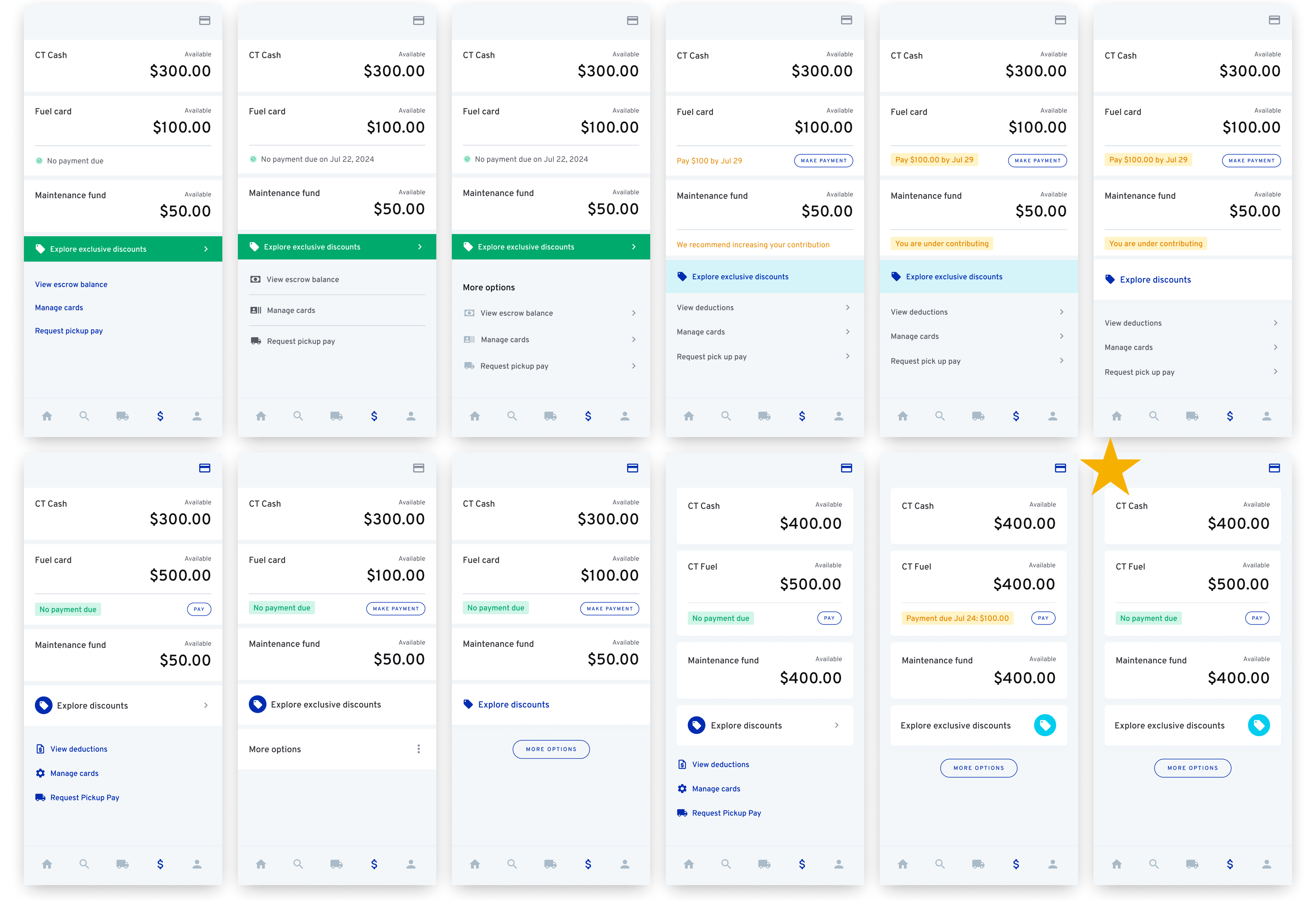
UI explorations on Cash page
When we tested the design for mvp with beta users, we found two problems with the sign-up flow. Firstly, on the sign-up page, some users missed important information. One big change is that user's Pickup Pay limit will drop from 30% of load price to 15%. Users called us after they applied for Fuel Card and complaint that they didn't know because they didn't read terms and conditions.
Another issue is when users failed Stripe verification, they will need to answer additional security questions. And if they fail to do that they will not be able to sign up for Fuel Card.

So we updated the design and refined the content to make it more scannable. We also added a video to explain how CT Fuel Card works. Users will also need to confirm that they have acknowledged important changes to Prickup Pay once they get approved.

To help users who failed Stripe verification, we are working with Stripe on pre-populating more info that CloudTrucks already saved for users to reduce the frictions. Meanwhile, as bandage fix, we send out an email with instructions on how to answer the security questions. And we choose email instead of displaying instructions in-app because email allows users to reference back to the instructions as they are answering questions.

Here are some highlight of the final design.
We did a cash home page revamp, bringing Fuel card and Maintenance fund to the home page. Now users can view and access different accounts holistically.

Unlike a traditional credit product, CT Fuel card mostly collects funds from job payment automatically, so we brought highlight on the available amount over current balance. Status pill changes based on the status of last statement balance.

Despite autopay from job payments, users can also easily make a payment from their CT Cash balance or linked bank account.

User can manage their fuel cards, adding cardholders, and lock card on the web app.

We launched the product for Beta users in Jan 2025. While we are waiting for more metrics, the initial feedback was very positive.

We are watching closely on how clearly users understand the payment collecting system of Fuel card, which is slightly different comparing to a regular credit card product. That will probably be the design focus of the next version. Besides this is only the MVP of Fuel card. We are currently designing more features to support user's needs. For example, increase credit limit, Fuel card complaints and in-app transaction dispute.

